Innovation Session: Best NFL Team
I am an Atlanta Falcons fan. This is by no obvious reason, I have lived in California for most of my life. A few years ago, though, I had the pleasure of working with Tony Gonzalez, aka. #88 & Tight End of the Falcons. Since then I have been rooting pretty hard for them. I want him to win a Super Bowl ring – he is a good guy and one of the best players the sport has seen. No one deserves it more.
The Falcons are having a good year, they are 11-1 and tied for first place. But, unfortunately they are getting less credit for it than they deserve. Despite their record, most commentators are less than optimistic about their playoff hopes. I hear a lot of that around the office as well. We can’t get no respect.
Tonight I will attempt to use a few of my data skills to visualize the NFL as a network graph to see it lends any strength to my opinion. I am hoping that by setting up the teams as nodes and games played as edges we’ll be able to see that the Falcons are clearly the best team in the NFL. If not – I guess I’ll have to be an honest data guy and trust what I find.
Challenge:
- Get clean data on the NFL 2012 season
- Vizualize it as a network graph
- Tweak the weights and layout to add context
- BONUS: getting the Gephi image API to work so the nodes are the team logos/helmets
Step 1: Get clean data on the NFL 2012 season
Getting clean data is always a bother – after searching for a short bit my best bet seems like ESPN. This page looks fairly clean right off the bat and I trust it’s accuracy (ESPN NFL scores & schedule).
A bit of cleaning and I have a nice edges csv – ideal for importing.
Step 2: Vizualize it as a network graph
The visualization tool I’ll be using today is Gephi, an open source tool that makes beautiful displays. (Trivia: LinkedIn hired one of the lead devs behind Gephi and he now gets to do cool things with them)
I ran into a bit of an issue with the fact that teams in the same division play each other twice. I counted each game as a directed edge with the weight being the diff in game scores. Unfortunately Gephi doesn’t support multiple edges between two nodes. Bummer. I think we will be ok though – if two teams play each other more than once, the two diffs will just combine into a single edge. A win & loss of equal amounts will cancel each other out.
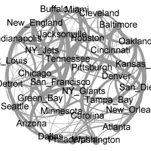
Now I’ve loaded the data into Gephi – here is what I’m seeing on first pass.
Step 3: Tweak the weights and layout to add context
My goal is to find the team that is best by seeing who has won the most games by the most points against the toughest teams. So in theory, more wins is good, but wins against teams with low records isn’t as good as wins against teams with large records. This seems like a perfect application for something like Google’s PageRank – I’m not sure if I’ll get that far tonight though.
The first thing I’ll do is apply a weighted in-degree to the node size. This looks at the amount of points the team beat it’s opponents by. Basically a seasonal point differential.
This highlights the teams that have beaten their opponents by the most points. Bigger team names = bigger victory margins. Atlanta isn’t doing too well here – they have been winning by small margins all season. The New England Patriots on the other hand had a few weeks where they made other teams look like youth teams as they ran the score up. That helped my fantasy team a ton on Thanksgiving.
Next up I am going to combine this with the total win-loss record. Using color to distinguish the teams with the most wins.
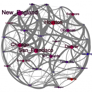
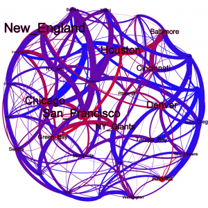
Now things are a bit more interesting. Teams in red have the most wins while blue teams have the fewest. New England might have a large point differential but they are only 9-3 right now, so they are in light purple.
What I want to do now is look at the opponents the team played. Winning is important, but winning against good teams is more important. We have already established a color pattern with blue teams being those with less wins (read: easy teams) and red teams those with more. Lets apply this to all of the edges to see what our strength of schedule looks like.
This one is a bit revealing. We can see some bright red lines between a few teams – Houston & Green Bay, San Francisco & The Giants, Denver & New England. These are the games you probably made sure to watch – the clashes of titans. My Falcons aren’t in many of those – the games against the Saints were great – but New Orleans is a purple team at best this season.
I want to do one more thing – apply a layout algorithm to this to place teams closer to opponents they played more often.
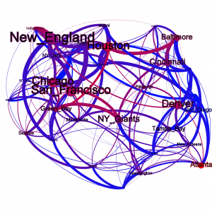
Of the power house teams in red, a few are much closer together, particularly those in the top left of the graph. Meanwhile Atlanta is very far to the bottom right – basically they were shielded from most of the good teams in the NFL and only played blue to purple teams.
Conclusion: Atlanta has done well this year, but their wins have been small and their opponents haven’t been the toughest. They have a shot at the title, but it isn’t an easy road ahead.
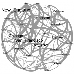
I’m running out of time for tonight’s innovation session – but I want to change one last thing. Just for style I’m switching the color scheme to ATL colors; black & red. There are still a few weeks left in the regular season, including our upcoming games with the Giants – but I think like myself most Falcons fans are most concerned with our upcoming playoff games. We can use this to remember which teams it will feel the best when we beat on our road to victory.

One thought on “Innovation Session: Best NFL Team”