Innovation Session: The History of NFL Win Percentages – Part 2
I’m going to pick up where I left off two weeks ago working on my chart of NFL team win percentages over time.
Last week I focused on getting the infrastructure setup, which was much easier than I thought, and walking through a basic tutorial to get a line graph working in D3. This week I’m going to do some customization.
Wins, Losses & Ties
To get the chart working last week I simply calculated the win percentage for the Falcons for a few seasons and plugged this in. Realistically that isn’t scalable, I’ll want to be able to input data in the form of a W-L-T season record and have it render.
To calculate a win % I will count each win as 1 point, loss as 0 points and tie as .5 points. I’ll then divide the sum by the total number of games to get a %.
When it comes to getting data quickly, wikipedia rocks. There is a page with all of the Falcon’s season data in a nice table format. I used it to create a new table with team, season, wins, losses & ties as my columns.
For the team value I’m using a single word key that I’ll be able to reference as I develop to link elements. For example, I will likely create a key to hex color reference dictionary so every team appears in their official color.
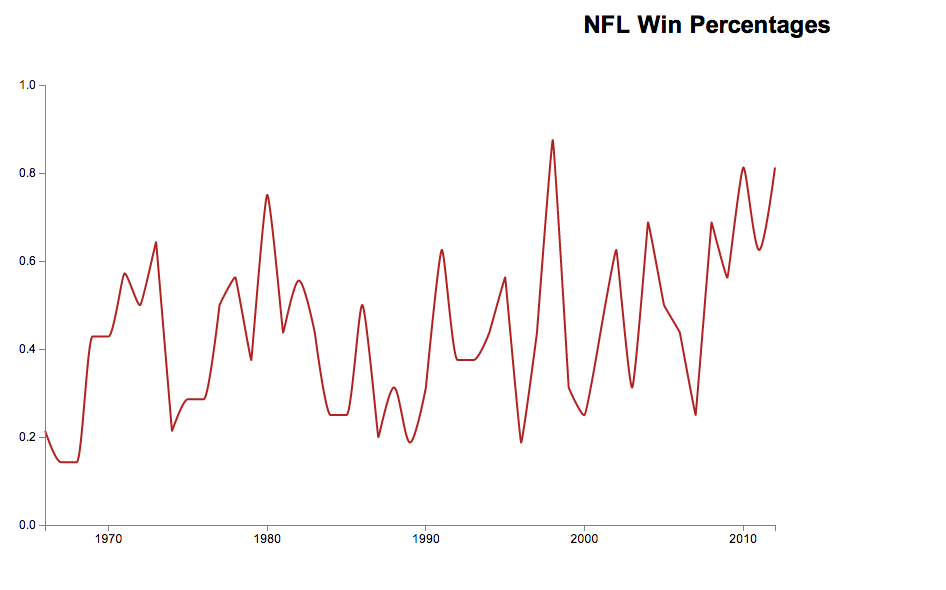
So now I have the history of the Atlanta Falcons.
Adding A Rival
One of the best parts about current NFC South is the historical parity. More so than any other division, we’ve all had our time on top and on bottom. Lately though, the Falcons and Saints have been fighting for the top spot. Last year we were 1:1 and the games were intense. This year we’re starting off the season with another battle.
Adding a second line the way I have planned is my first big roadblock. Most of the tutorials I’m seeing are suggesting adding a new column to add a new line. I’m not sure this will work for me because I have already defined my charted value based on a calculation of three columns. If I added three more columns for every team I’d end up with 96 columns and a lot of code to parse them. I’d prefer to just add more rows that can use the code I just wrote and instead use the name column to distinguish the sets.
Unfortunately, javascript data manipulation isn’t my strong suite. After a number of failed attempts I finally got something sort of working. For now, both teams are on the chart but the code certainly isn’t clean. I basically created filters for each team and have two functions for plotting, each dependent on one of the filters. Feel free to take a look at the code an let me know if you have any tips: Greg Kroleski Github.
I want to build my keys dynamically from the csv team column and loop over each one creating a new line. I would also like to pull in the colors while doing this. Hopefully I can get there next week – but for now – here is where I ended up.
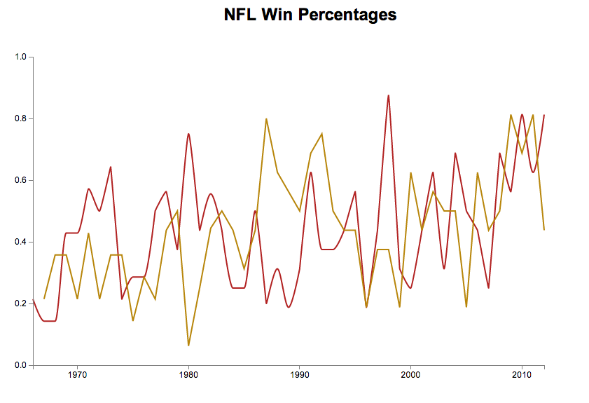
Or, for the next week you can check it out live on my NFL Standings page.
Do you know the total of matches and total of net points of every NFL , AFL team from 1960 until season 2015