Innovation Session: The History of NFL Win Percentages – Part 7
As a hobbyist developer, I have always been grateful for help from others. Whether from friends, co-workers or strangers. A few weeks ago Mike Bostock helped me figure out why my chart wasn’t rendering by answering my question on stack overflow. Mike is, for those of you that aren’t data visualization nerds, the creator and lead developer of D3, the javascript library I’m using to create this chart. Super cool.
It turns out when I had re-written the code I had accidentally let two lines slip to the bottom. Those two lines defined the scope of the graph and without them running fist, the whole thing broke.
I knew it was going to be something small like that, it always is. Except for when it is something big.
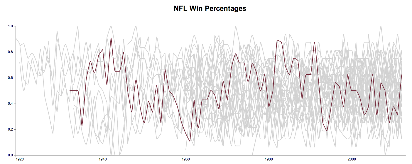
I now have all of the data loaded and rendering. It is quite a mess and not labelled. Check it out for yourself.
Looking at all of the data I’ve realize my initial assumptions were a bit wrong. I though there would be more gradual lines but in reality there are many large jumps between seasons. This resulted in what I would basically describe as a rainbow hairball when I first rendered it. In order to calm things down I switched all of the lines to render grey at first and appear as the team color when hovered.
In the coming weeks I’ll have to figure out how to tell this story a bit better by adding labels, highlighting and additional interaction.